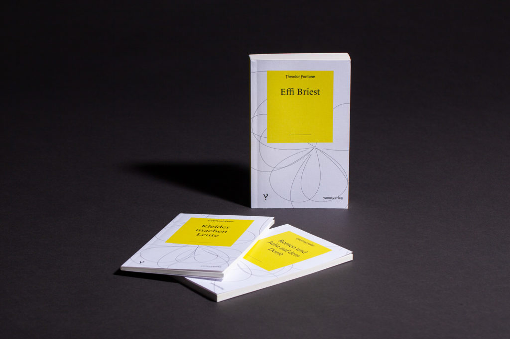
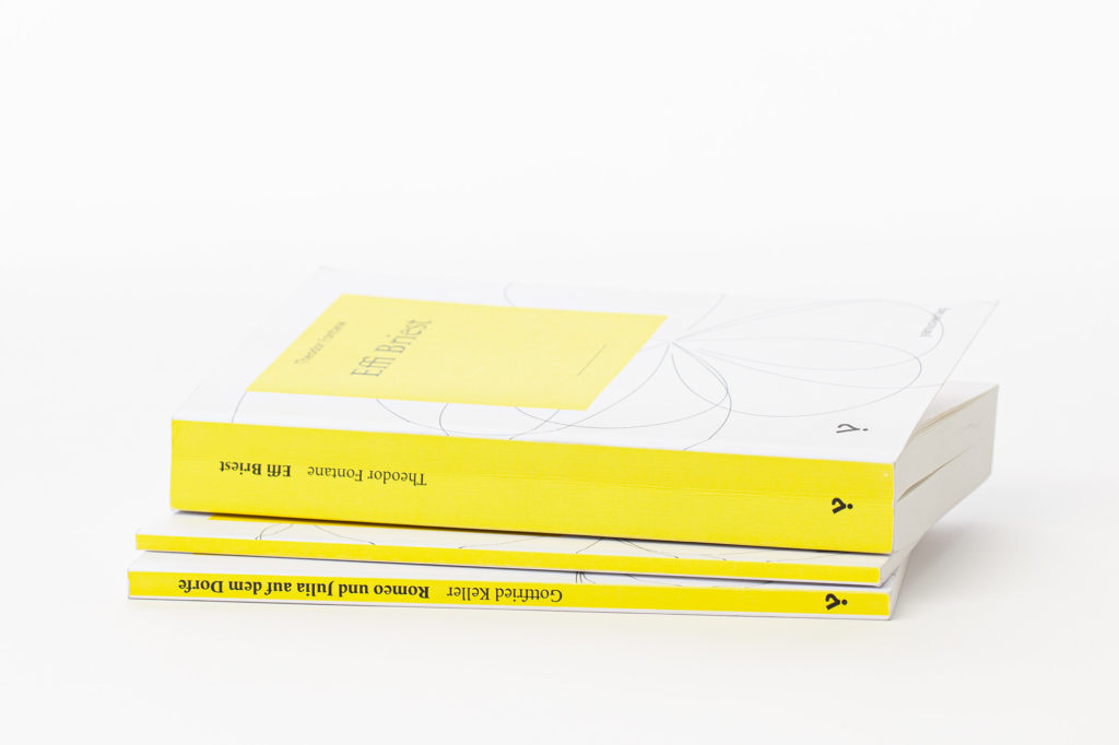
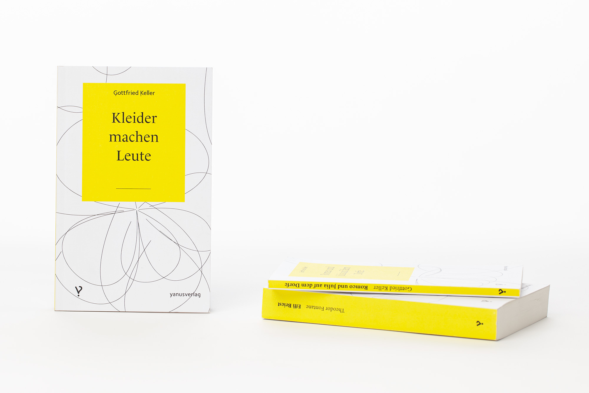
The programme of the publishing house, founded in 2009, contains classical and also printed paperback books, as well as e-books, and – with the tandem book – a mixed form consisting of analogue and digital content.
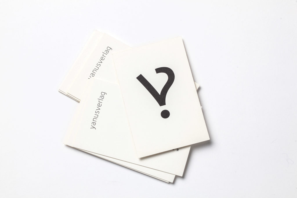
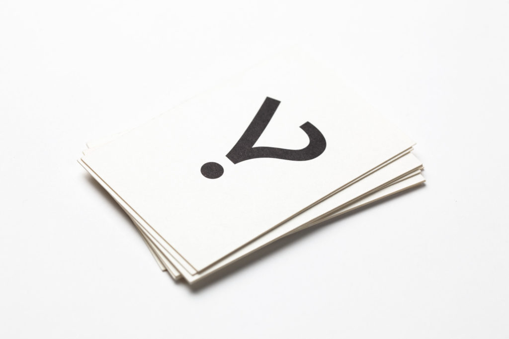
The bipolarity between analogue and digital was one of the decisive aspects in the process of finding a name, and then also in the choice of "iterrobang", a hermaphrodite punctuation mark, consisting of exclamation marks and question marks, as the company logo.
Each book cover is generated individually, by means of processing a certain algorithm, and printed as a PDF. The challenge in developing the system applied to the cover consisted of attaining a liveliness and individuality which is possible through digital printing "on demand", while also remaining faithful to the clear line defined by the publishing house.